Reflecting, as we all do at this time. What is the take away from the year gone? What do we aim for in the coming year?
2018 was a year of exponential growth for me, a feeling like my eyes have been opened and I’ve learnt so much but even so there is still so much more. The possibilities make it exciting, the challenges make it daunting.
I know now what I need to focus on, where I can build on myself. Actually I think I’ve known for a long time but only now do I feel ready to admit my fears and push myself to overcome them, take the plunge, so to speak. Throw caution to the wind. Stop worrying what others will think, if they will judge (cause they will, you can’t stop it) and face the challenges head on.
Does this read like a pep talk? I’m giving myself a pep talk. Enough of that. Moving on to the Thank Yous!
I had the opportunities to collaborate with some pretty outstanding designers, builders and of course my wonderful clients this year. Each project has been rewarding and exciting, I’m so thankful to have had the chance to work with all of you. I can only hope there are more opportunities in coming year! Thanks to all who have supported myself and birdhouse design throughout the year, I appreciate it all and believe me when I say nothing goes unnoticed.
I think that’s enough waffling for one post, about time for a celebratory drink, no?! Cheers, to the new year and all it holds!
As I was ambling through wechat moments the other day, I noticed some photos that seemed remarkably familiar, yet not at the same time. It looked like the brewery I designed last year for German Brewery Zapfler, the one in Found 158. But then the caption to aforementioned photos read something about Aussie beef burgers? Huh?
So I went to check it out. And yep, yep. A burger joint has literally found all it’s inspiration in our brewery design. It was like they had ripped out the wall from Zapfler and transported the thing whole. So imitation is the highest form of flattery? Ok, but we had reason behind our design. We don’t just design something because looks good, we think about context, about brand identity, about functionality.
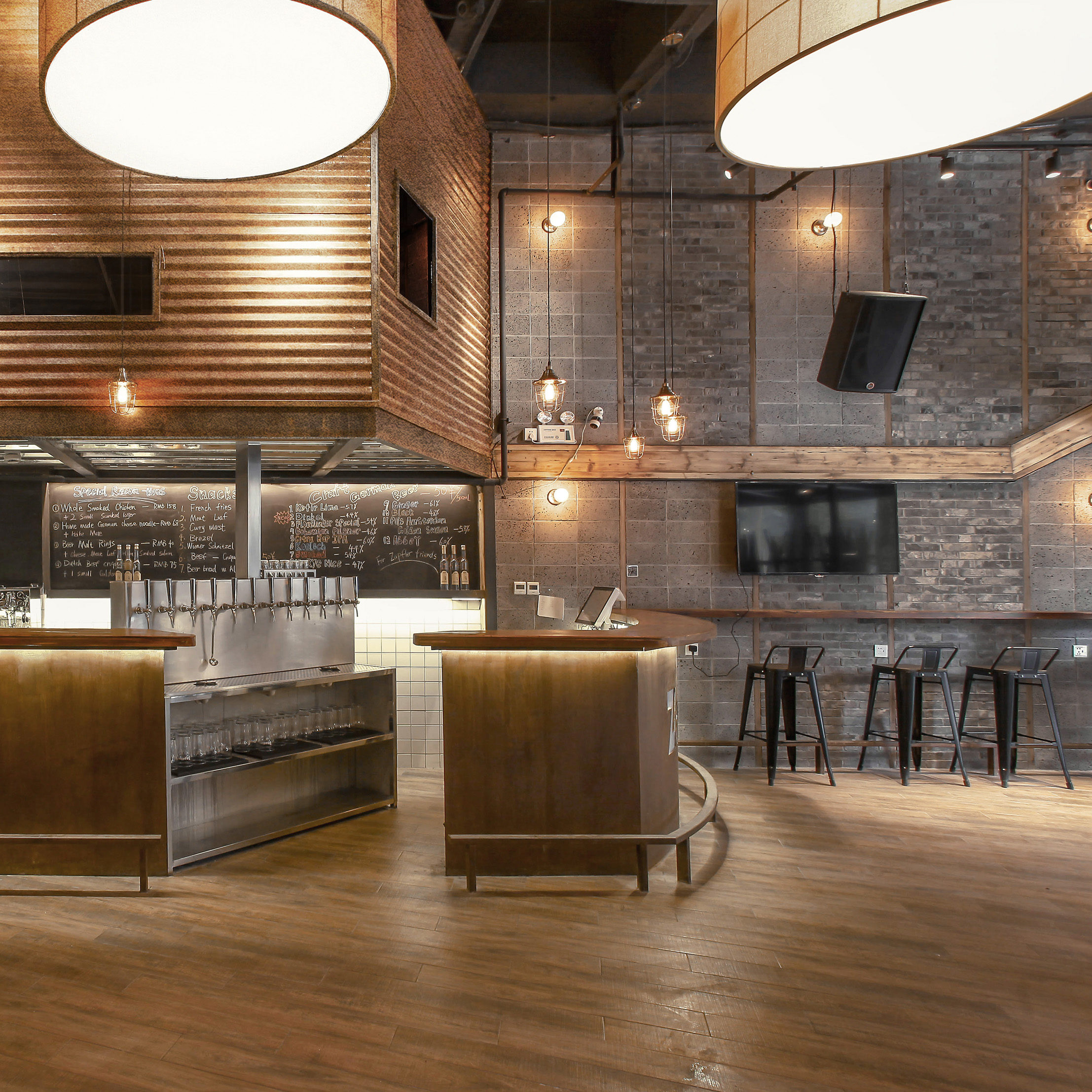
Zapfler German Craft Brewery – The cool roomThe burger joint – ??
Let’s start here. Zapfler’s cool room above the bar – their something above the something.
Corrugated iron sheeting wrapping a volume within the space, punctured by three windows of varying shapes. Granted, they left the sheeting un-rusted, but the similarity is still unmistakable. But why did we do this the way we did? At a functional level, the cool room holds the kegs of beer, and because we had a narrow but high ceiling-ed space, we chose to raise it above the bar, giving back more space to patrons and allowing easy flow of beer from the kegs downwards to the taps. At an aesthetic level, the cool room volume became our focal point of the design because this is a brewery, and Zapfler having already established their image as an industrial style, the materiality and form sought to reflect that style.
Zapfler German Craft Brewery – Logo designThe burger joint – logo design
Logo design is usually considered fairly personal, fairly uniquely representative of your brand, and developed after careful consideration of the image you want to convey. Rusted metal is one of Zapfler’s primary materials, evident throughout the scheme. It makes sense it would feature as a backdrop for the logo. This burger joint however… I mean… why??
Zapfler German Craft Brewery – Mezzanine entranceThe burger joint – Mezzanine entrance, kegs on display
This is interesting. Not only did they copy the mezzanine over the entrance, but they also decorated it with kegs. Now, we decided to display kegs and wheat bags there because Zapfler is a brewery. The façade is glass, so displaying kegs to passers-by tells potential customers who Zapfler is, what their story is. But this burger joint? Surely there should be something burger-related on display? Call me crazy.
Zapfler German Craft Brewery – Facade patterningThe burger joint – That’s MY facade patterning!
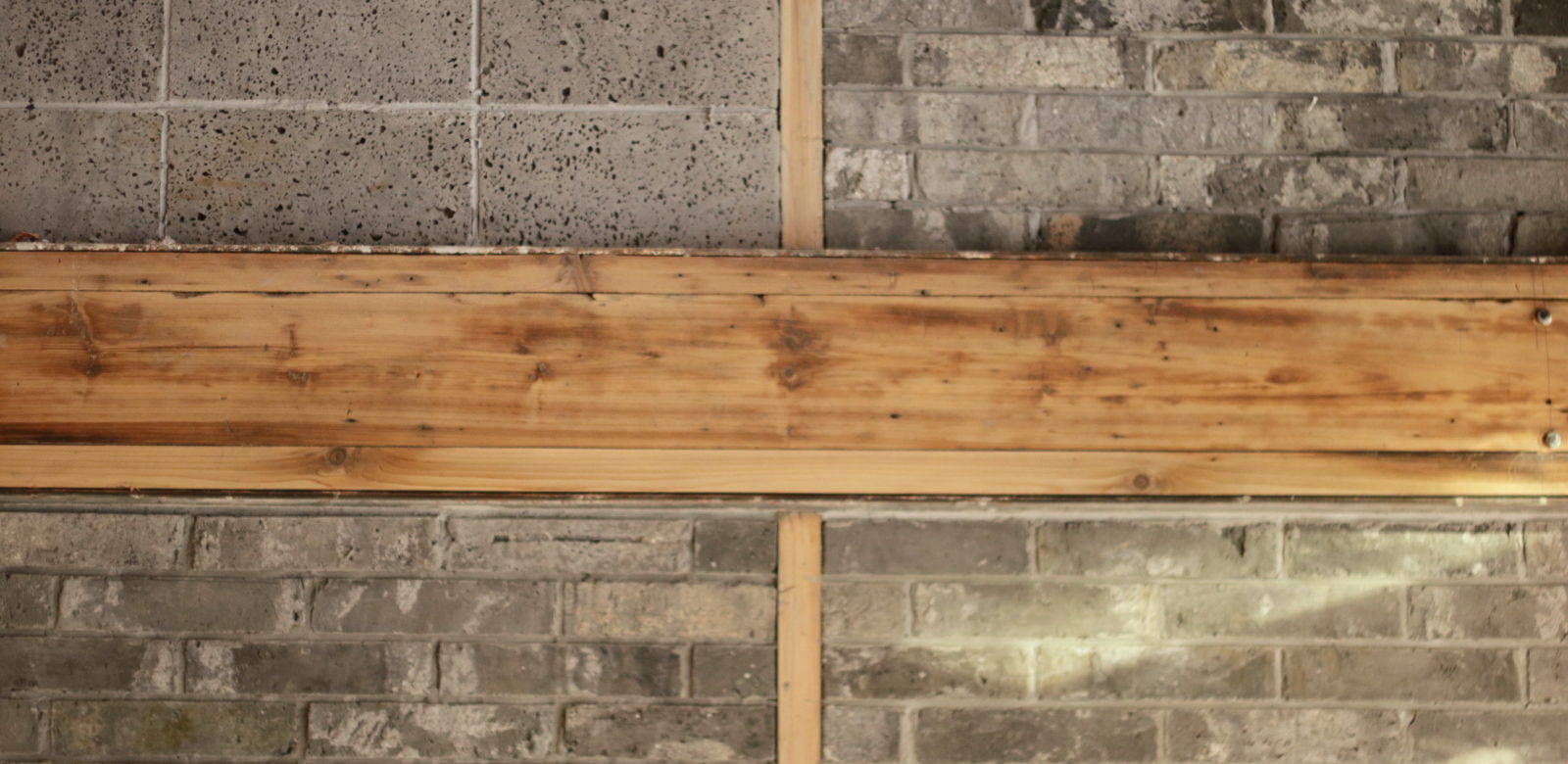
Do I even need to point out the brick and stone wall pattern? That was a design taken from Zapfler’s original Jintan location, adapted to the new space and developed to bring warmth to the industrial aesthetic. I’m quite fond of it. Note the fermenters lining the wall. Zapfler also has fermenters on display, becau BREWERY ! ! !
One more thing I will point out is the timber beam that creates a datum around the space, that dips and rises due to spatial requirements. It was a design feature that arose from the opportunity presented by the site. Levels change throughout the space so we linked them with this undulating strip of timber. Whether or not their space was faced with the same requirement resulting in the similar design, I do not know. I feel unlikely.
And another thing. We use real reclaimed timber, sourced locally, with all it’s natural richness and texture. None of this veneer crap.
So in an attempt to disguise the fact I was there purely to photograph the place, I asked for a beer. My options were Budwieser, Hoegaarden or something unfamiliar. Not the best range of beers for a place who displays kegs and wheat bags and fermenters everywhere. I have never been a big fan of Hoegaarden, I find it quite tasteless. But believe me, this particular over sized pint was full of flavours – ranging from bitterness, sourness, disdain, anger, all the way to pity, resentment and even to a weird flavour of satisfaction. And sure, a hint of flattery.
Eat your heart out, Pompidou!
Or should I say thank you, for shining a stage light on the incredible system that is a building, in this day and age.
Everyone inhabits these creations, but many do not realise the amazingly complex work that is required to make them habitable. The labourious work performed by the various tradesmen/women often goes unnoticed and unappreciated (oh yeah, I hate the constant noise too, so much). Well, guys, consider this my thank you post. For I can see the art in your work, just as Renzo Piano, Sir Richard Rodgers and many other Architects can.
Lin Residence – Blue Poles – Internet connectionLin Residence – The Green Mile – Water supplyLin Residence – Hope of a Condemned Man II – LightingLin Residence – Composition with Blue – Heated water supply to radiant heating panels. And Internet connectionLin Residence – The Heart and the Circulation – White arteries = fresh air vent. Black veins = Air conditioning. Red capillaries = ElectricityLin Residence – Composition VII – The electrical masterpiece
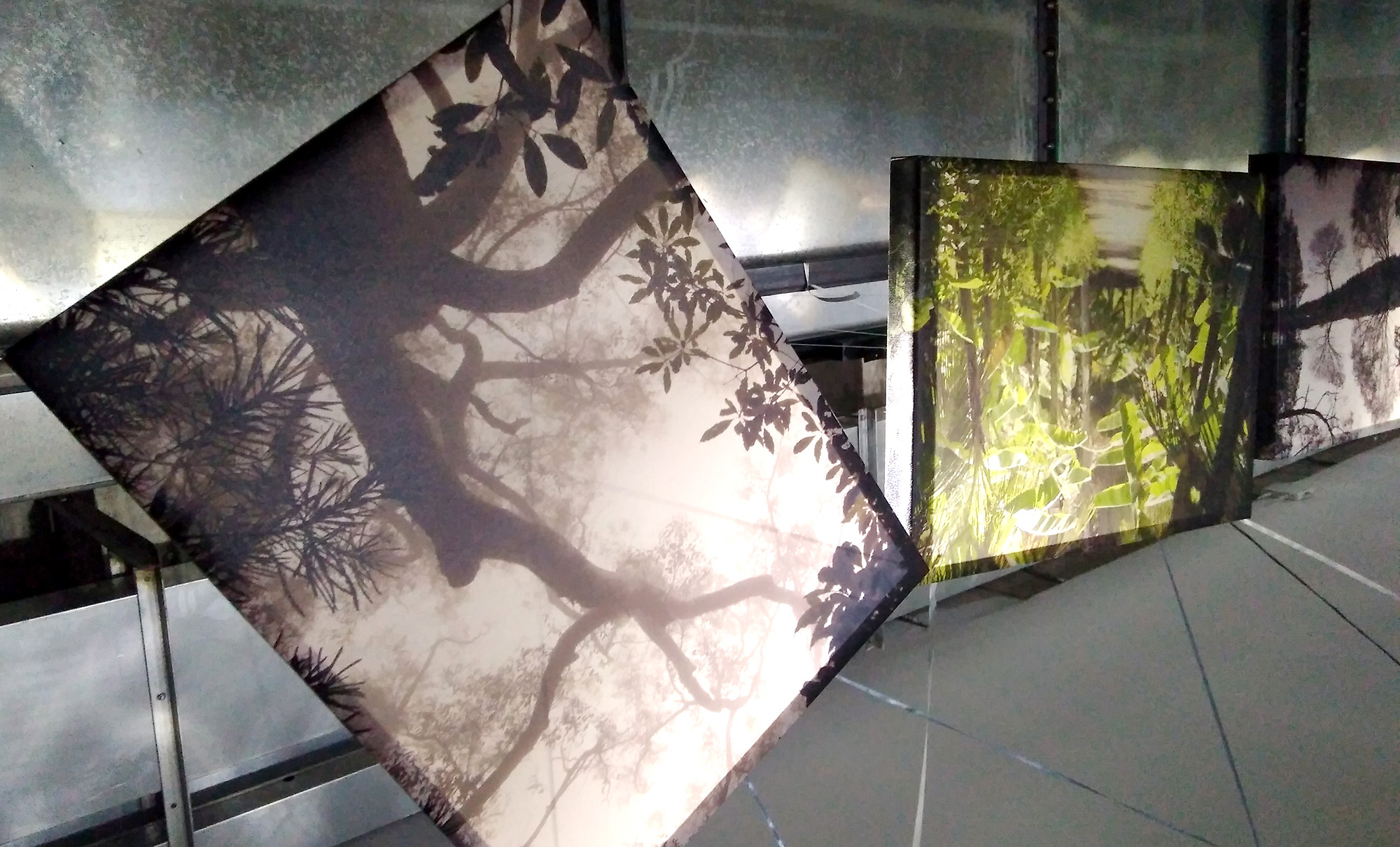
Took some time away from the construction site last week to take part in a photo exhibition for Tongji University Design Week. The given theme for the whole event was ‘New World’. Certainly a theme that permitted some interpretation.
My good friend Francesca who lectures at Tongji, Urban researcher Lena and myself decided we could combine our travel histories and compile a collection of photos covering almost every continent of the globe, and in curating photos that represented cultures or places perhaps lesser known to most people, we are able to show times in our lives we have experienced new worlds – in a physical, cultural or spiritual sense. We then had sound engineer/artist Eugenio come in and add an enchanting, ambient soundscape to play continuously alongside the photos. The result is a truly immersive and other worldly experience!
(video requires vpn and sound!)
It was also great to work with some creatives in other fields, as well as some of the design students of the University. Of course we did it all at the last minute (like any good university student) which brought back some fond memories from my university days, hanging out at the studio into the wee hours of the morning!
Tongji Design Week – setting up 1Tongji Design Week – setting up 2Tongji Design Week – setting up 3Tongji Design Week – setting up 4
Press Release:
Floating Modernity of the New World
新世界浮动现代性
Photographers
Lena Kilina – Russian Visual Researcher
zifeng@mail.ru / www.kibilina.tumblr.com
Shelley Mock – Australian Interior designer
shelley@birdhousedesign.net / www.birdhousedesign.net
Francesca Valsecchi – Italian traveler of physical and imaginary worlds
francesca@tongji.edu.cn
Soundscape
Eugenio Altieri – Italian Sound designer/Music producer/Visual Artist
www.eugenioaltieri.com
Floating Modernity is an immersive experience of photography and soundscape. New World is how we define the numerous places we visited as journeys into creative exploration and human wandering. Alternative to mainstream storytelling, our pictures and recording show the ‘New World’ at the scale of the human being, through fragments and landscapes, gestures and movements. It aims to engage the participants in a virtual journey through a small scale storytelling able to represent the local details as well as global trends, together with the contradiction and surprises within both. In this contemporary world of frantic visual stimulus and continuous images flow where everything seems endlessly mutating, bright, and digitally coloured, photography has the incredible power to distill moments out of time and space, despite its nature grandly rooted the place and present. Perhaps for this reason, it is the medium that still helps humans to clarify visions of what is possible and enlighten the diversity of what exists.
In this exhibition we showcase pictures that are meant to be read by a slow full-frame immersion rather than being swept away at the speed of mobile screens. The images presented aim to reproduce a wandering in the ‘New World’, across the traces of the past and its decadence, and the landmarks of the future and its opulence, across the unusual and the ordinary of that process we name as ‘development’, which is a rather simplified word for the complexity of the change that is humanity, society and environment are addressing.
Walk into, and welcome to start a journey into new worlds where paths of complexity can be imagined, discovered, and shared.
Time – October 11th- 25th 2017
Place – Tongji University Shanghai Campus, D&I Main Building, corridor between library and darkroom
Moeraki Boulders, New Zealand 2011 Francesca ValsecchiSan Cristobal de las Casas, Mexico 2006 Shelley MockFez, Morocco, 2015 Lena Kilina
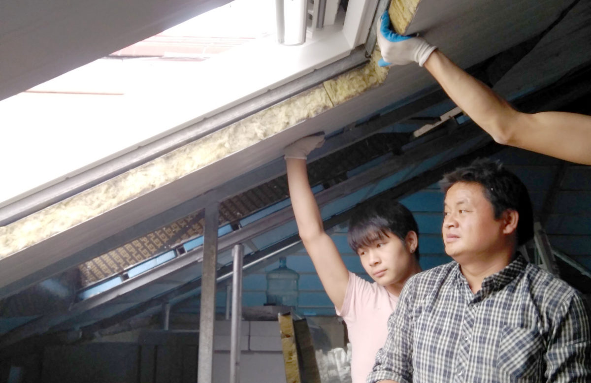
Lin Residence – Getting InsulatedLin Residence – Insulation in progress
These happy chaps will finish installing the internal layer of insulation today.
Yes, that’s right. We have two layers of insulation!
The external layer is rigid blue foam, 5cm thick and was set into the existing steel structure of the roof. This second layer is mineral wool insulation, otherwise known as rock wool. It is 7cm thick and already we can feel the difference in temperature under that roof (admittedly, we started building in the dead of summer – those first site meetings were pretty arduous – we won’t really be able to compare until next scorching summer).
Lin Residence – Roof Detail
As I watched them haul the massive sheets up it occurred to me that using so much insulation is somewhat of a rarity in Shanghai, particularly in a residential building. I also realised that all through the design of this apartment renovation, Mr Lin, our client, has done a lot of research into passive energy design methods and materials, including in-floor radiant heating, centralised HVAC systems and recycled materials to name a few.
For those unfamiliar with building standards in Shanghai, let me give a brief explanation. Common sustainable design methods are not standard practice. Things like passive heating and cooling, insulation and double glazed windows are not common, while solar panels, grey water tanks and composting almost don’t exist. Only in recent years, in the wake of terrible pollution, has sustainable design begun to take root.
So it has been a very positive experience to work with Mr Lin in implementing these simple and cost-effective passive techniques. The insulation is not as expensive as one might have thought, and it is going to go a long way in reducing electricity bills. On top of that, Mr Lin has chosen a centralised HVAC cooling system and radiant heating panels, both of which use much less energy than fan-forced wall-mounted units, not to mention produce a much more comfortable air quality.
I attended a talk on healthy buildings and sustainable design recently. They talked about how building standards these days should not only include reducing environmental impact, but must go further, and include practices that reduce the impact on our health. A large percentage of the pollution in China is caused by the buildings in which we live and work, from the materials and by-products during construction, to everyday usage of air-conditioners, heaters, lights and water. When you realise that the fan-forced wall-mounted air con system in every room is as bad for you as it is for the environment, you realise that sustainable design and human health are not mutually exclusive, they are actually the same problem. Solving one is solving the other.
Lecture by GIGA at Howarth Showroom
The talk went on to discuss how little people know about what goes into a complete building. While ingredient labels on food products have been around for longer than I can remember, there aren’t the same requirements for ‘ingredients’ of a building. Why not? People have a right to know if something contains formaldehyde, or was treated with chemicals, or produced vast amounts of smoke in its production. All of these things affects the air quality both inside and outside the home.
Returning to our little project, although fairly small in square meters, the difference we are making to our client and his family’s quality of life will be huge. We are really looking forward to seeing and feeling the finished result, and hopefully we will have more clients in the future with the same enthusiasm as Mr Lin.
There’s that very old and overused expression that keeps coming up in my mind;
If these walls could talk…
I can’t help it. I really didn’t want to open with that, I tried to think of something else. But nothing else fits quite so well.
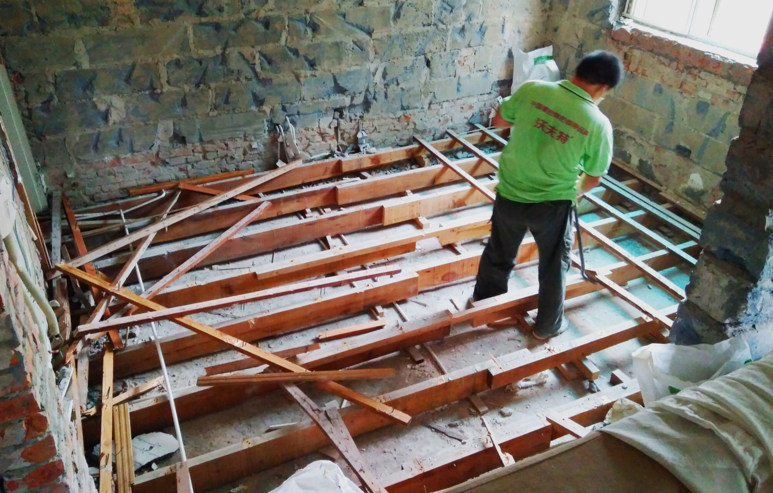
We have gutted the apartment and what is revealed are layers of history visible by the changes in shape, colour, structure, material.
It had been told through urban tale that this apartment was once in fact two smaller apartments. Now as we strip it down to its bones, we start to see how those apartments might have looked.
The first and most obvious tell-tale is the door-shaped patch of big blue masonry blocks sitting neatly in the otherwise red brick wall. So the door to the bathroom used to be there. The same blue patch appears on the other side of the bathroom, indicating another door into the same space. From this and the placement of the pipes we know that the current bathroom was once split into two tiny bathrooms, one for each tiny apartment. They backed onto each other, more than likely they were symmetric.
Lin Residence Demolition 01 – The secret door
Next we demolished the wall between the master bedroom and the study, where there was what seemed like a structural column. We weren’t even sure we could demolish it. But it’s not structural at all. It’s brick built around an iron pipe. Water drainage. This used to be the other kitchen. And the pipe cannot be removed as the apartment below still uses it. Luckily we will be able to hide it again in the latest iteration.
Lin Residence Demolition 02 – The hidden pipe
As we removed the timber flooring, we noticed several changes in the height of the concrete slab. It is high at the kitchen and entry areas, then it drops about 10cm in the living room and master bedroom. Wet areas like kitchens and bathrooms do tend to be higher levels to accommodate piping, but at the southern end closer to the balcony the slab raises again by 8cm. Then on the balcony itself its another 3cm higher still. How peculiar.
Lin Residence Demolition 03 – Slab irregularities
Our explanation is provided by the builders, who have much experience in renovating old Shanghai buildings. That extra height in front of the balcony was a later addition in order to hold the weight of the balcony. In other words, the original building had no balconies. The original two apartments would have looked something like this:
Lin Residence 4F Original Plan
It’s so hard to imagine how families could have lived in these small apartments. Although I suppose a quick trip to Hong Kong and you would get the idea. But it’s certainly fascinating to see how much the floor layout influences how we live. Below are the plans of Mr Lin’s previous apartment, and future apartment. Interestingly, the bathroom will go back to almost its original size. It will, however, be supplemented by a second bathroom in the new loft level, with a bath tub!! The rest of us continue to dream.
Lin Residence Existing 4F Floor PlanLin Residence 4F New Plan
It never ceases to amaze me how each project comes with its own unique set of quirks (read: issues). You just can’t cookie-cut design.
Next week the demolishers will clear out and construction will commence on the Lin Residence renovation project. We began the design process back in February! No we have not been designing and redesigning for the last 7 months. There were several big issues (read: quirks) that we had no idea how they would play out. The most critical was whether or not Property Management would allow Mr Lin to reclaim the disused roof space above his apartment, and convert it into a second floor.
birdhouse impression of Lin Residence’s new living room
A little history about this building:
It was built during the 1980’s, one of several low rise apartment buildings in a compound (小区) in the Former French Concession. Shanghai in the 80’s saw a dramatic increase in population – the city was redefining its reputation as a high-tech, international, economic emperor, and the people were 来了-ing (coming in droves). So developers rushed to build as many buildings as quickly as possible to accommodate all the new citizens, not really able to foresee how much Shanghai would grow in 30 years. Who could have? It was unprecedented.
Because of this sudden increase in demand, building quality was not a priority. Nor were architectural aesthetics. Speed was the winner. Speed and budget. Our project is housed in a concrete box, 4 storeys high (my client on the forth), originally with 3 apartments on each floor, each of approx 36sqm. Mr Lin’s current apartment is the combination of the two southern facing apartments.
Some time later, after many many concrete boxes lined the streets and alleys, some urban planners with guanxi (it’s all about who you know…) decided the boxes were unattractive, and at the very least they should have a pitched tiled roof. That this would make the city pretty again. So all the buildings in our compound and all the ones around it were given fancy new hats.
And this is largely what you see today.
View over Former French Concession
Does it work? Is it pretty? Well it doesn’t make it worse that’s for sure. What it did do, in the case of Mr Lin, is provide a great opportunity to build into it. Did they realise in doing this they were providing for extra floor area? I doubt it.
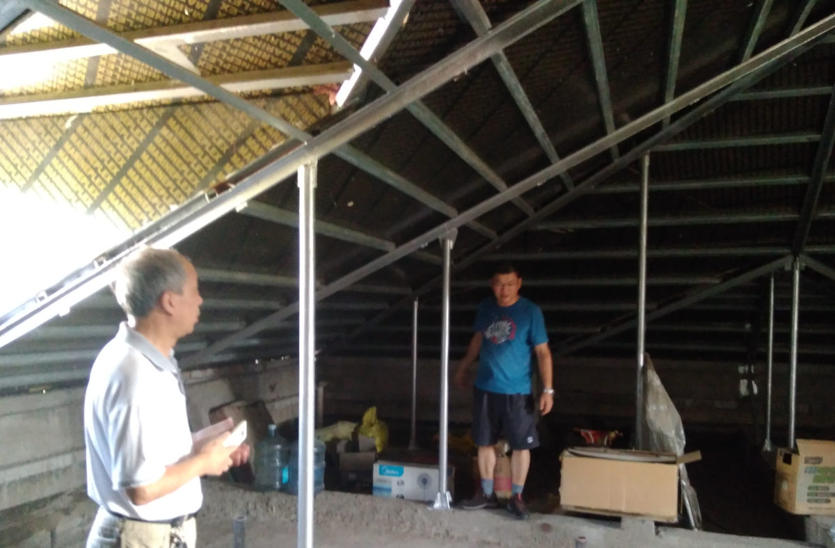
The pitched roofs were approved for two reasons; firstly for aesthetics as mentioned, secondly to provide an additional thermal barrier during hot summers. However, at the time birdhouse was involved, the roof was in such bad shape it gave no protection – holes everywhere, the steel structure supporting it completely rusted or eroded away even. And the structure itself is excessive, columns everywhere on strange little concrete beams. It required a huge and costly amount of repair work before anything could be added.
We had these questions for Property Management. In this order:
Would you please pay for and organise repair work on the roof please?
May we please build a second floor in the roof for private use please?
While you’re up there, would you mind demolishing that unused water tank that’s taking up useful space please?
After a long period of guanxi negotiating, the bribing with cigarettes, Chinese wine, and I don’t know what else, moon cakes probably, we got our answers back:
Yes
Yes
No.
We can work with that! 谢谢!
I’ve worked on large architectural projects before that have never been built. They were very unsatisfying. But this felt different. As we were designing, in the back of our minds we knew there was a chance it could never be realised. And the more we pulled the ideas from concept into form, the more we saw the potential for a really great space. It would have been devastating had it been turned down. For all involved. But we were patient and co operative and I’d say that saved us. It is so important keep a good relationship with your Property Management. They can make your life easier or much, much harder if they choose.
So management sent out a team to repair the roof and they have done a good job. Its waterproof and insulated as well. They did add more columns in… but thankfully we’ve been given approval to build and our Contractor is able to reorganise the structure.
Lin Residence existing roof spaceLin Residence repaired roof space
Which brings us to today, with demolition almost done and construction about to begin. We’ve found more issues as we demolish – old pipes embedded in walls, uneven slabs to name a few. To be expected of a 30 year old building. After overcoming that major hurdle, these are easy peasy. I see these issues – quirks – as opportunities to celebrate uniqueness and character.
Another 4 months of construction to go. Let’s see what other quirks we find along the way!
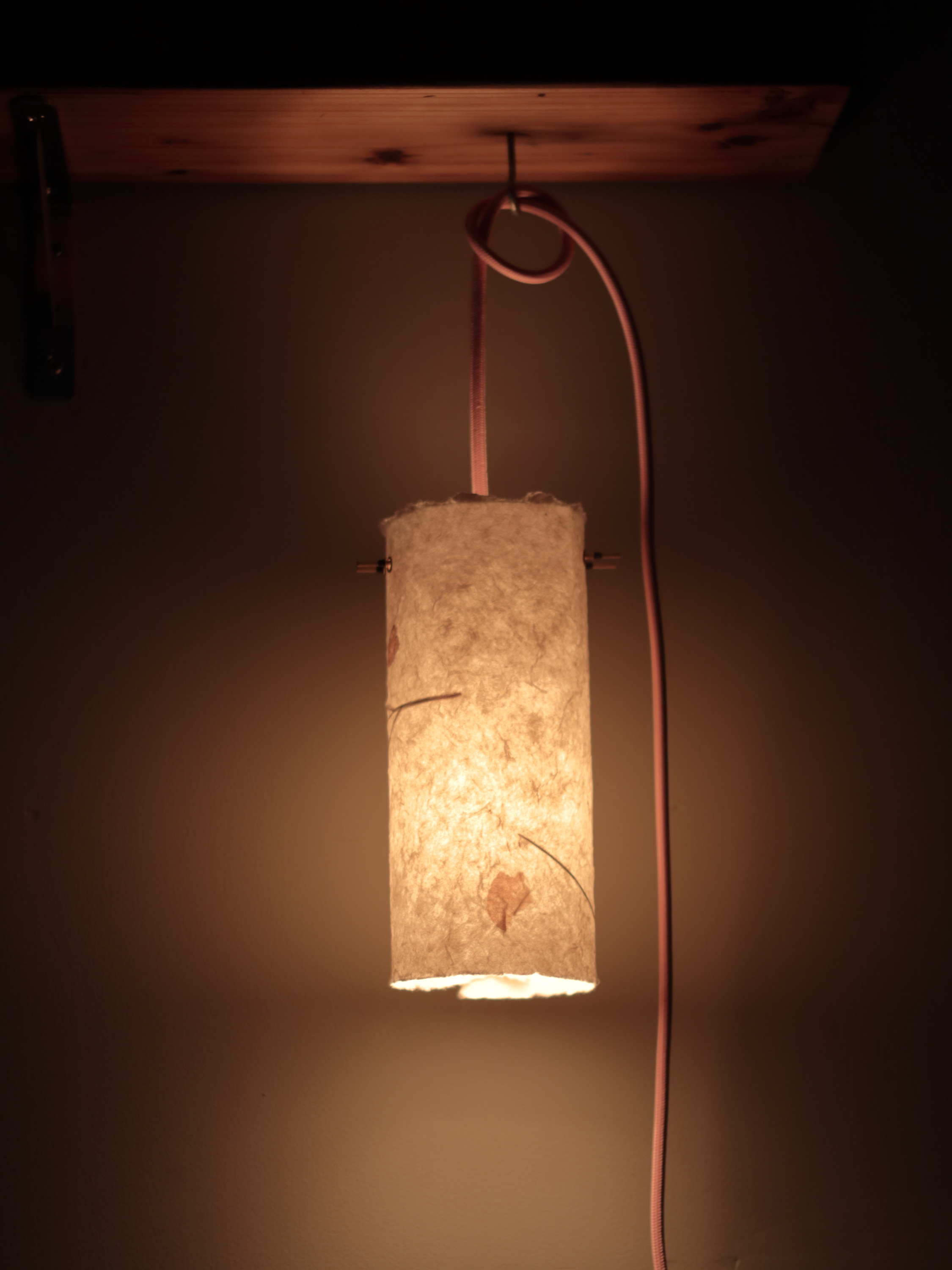
Keen to try new things, birdhouse is looking into producing pendant lights for sale.
Inspired by a recent trip to Japan, I wanted to find a simple way for people to appreciate the importance of good lighting. The Japanese are masters in creating ambience out of minimalist objects. And given that many people here in Shanghai are renting apartments, it’s preferable not to leave too many scars.
These pendants connect straight to a socket and can hang from either an S hook, stuck on hook or screw hook. This makes keeps installation to an absolute minimum. Cables are available in a range of colours and the paper is handmade, also available in different styles. It’s the paper that really creates the atmosphere, diffusing the light to a dull glow. Tanizaki’s In Praise of Shadows comes to mind. One of a few books I can read over and over.
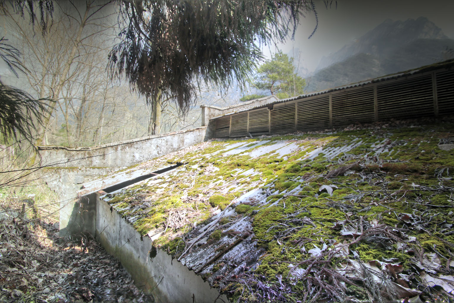
Took some time between jobs to visit Huangshan (Yellow Mountain) with the folks last week. It’s nice to be reminded of the amazing natural beauty China has to offer. As I say every time I escape the city – Must Explore More.
As we walked up to the entrance we passed a disused building. Not a particularly interesting building, simple concrete structure seen widely throughout China, with the typical upside-down stepped profile on the gable ends. What makes it beautiful is the fact that nature is reclaiming its territory, slowly decomposing the bones and returning it from whence it came, proving yet again – nature always wins.
With the majestic mountain in the background, it provided an excellent opportunity to practice some HDR photography.
Down at Found 158 this morning, it’s like a ghost town compared to the frenzy of building activity that has been constant for the last 2 months. Chinese new year approaches like a distant storm – its presence can be felt long in advance, when suppliers and contractors start saying things like, ‘oh no. We can’t possibly have that ready in time.’
But the holiday doesn’t start for another 3 weeks.
‘Yeah, but nah.’
In other words, they may still be onsite physically, but in their minds its already holiday. And I suppose I can’t blame them. Its their one and only holiday. The only time in the whole year they will see mum and dad, wives or husbands, their kids. So go. Take a break. Shoo shee sharrr! (say it out loud. I reckon my Chinese phonetic spelling is pretty spot on)
Post holiday, following the return of the migrant workforce (whenever that will be), the brewery is probably only a couple of weeks away from completion! This is exciting. It’s been left in a relatively clean state, only a few minor things still to fix. Kitchen equipment is already in, brewhouse equipment will come later, as well as furniture. For now, all I can do is sit back and watch the sheet iron rust (don’t assume it’s like watching paint dry) into a beautiful red hue!
From the birdhouse team, xin nian kuai le! Bring on the Rooster!


